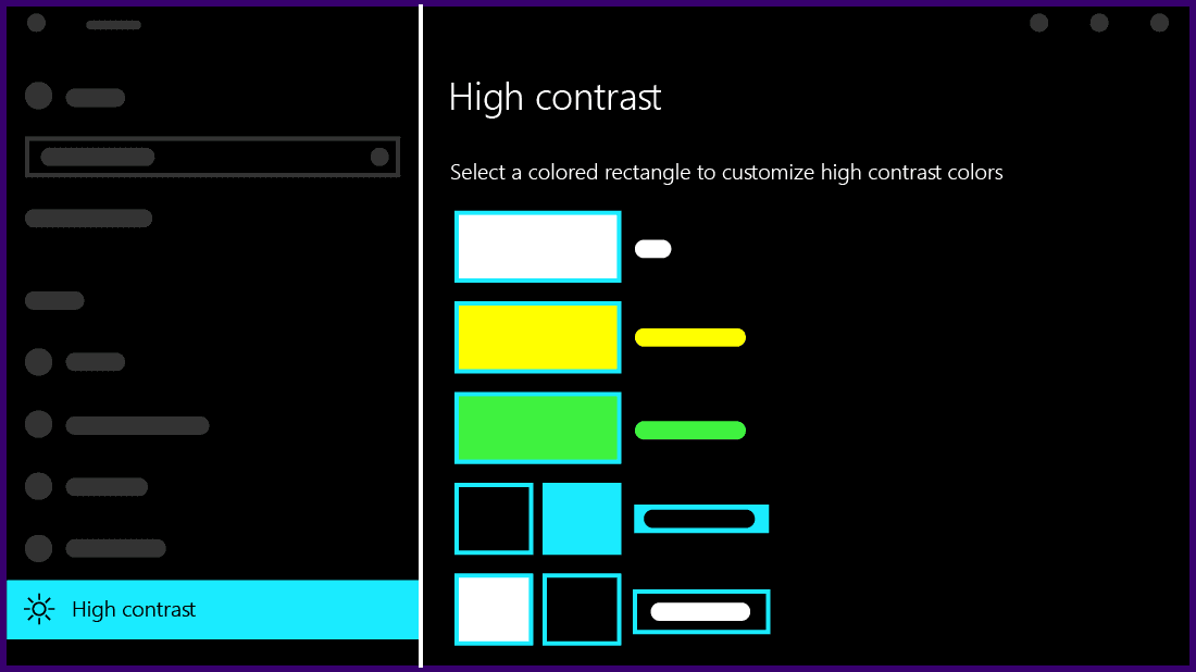
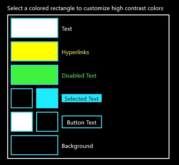
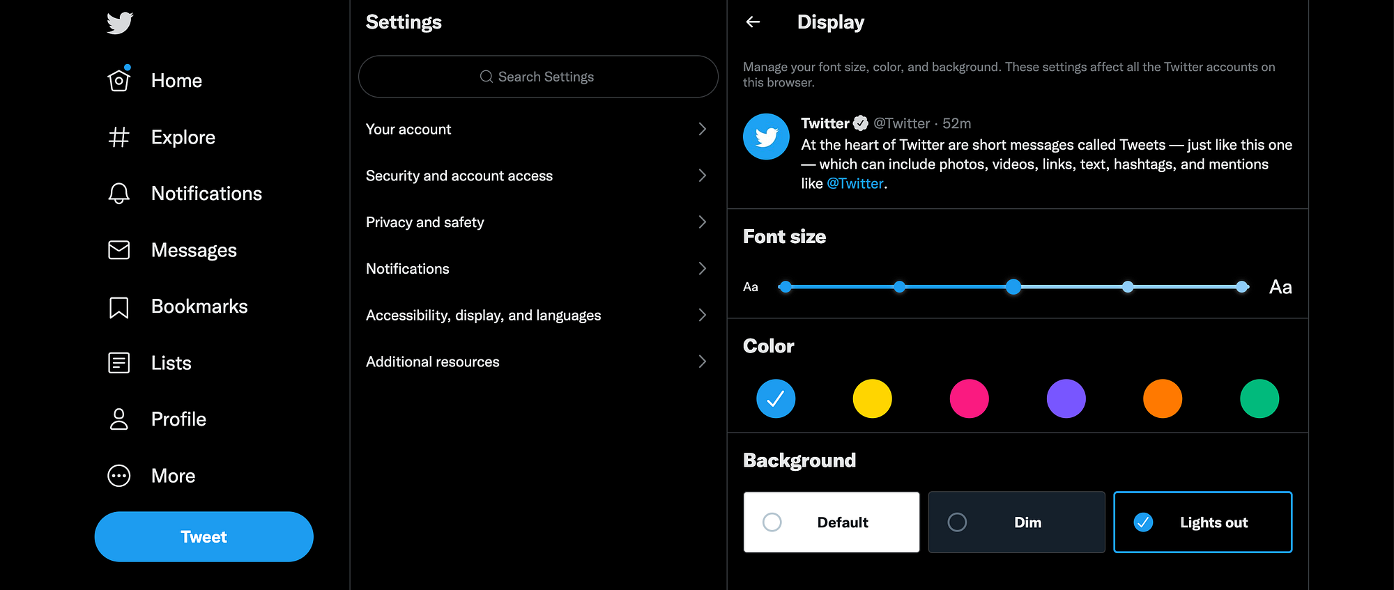
High contrast readability mode is a feature designed to enhance visual clarity and accessibility for users interacting with digital interfaces. Its primary function is to increase the distinction between foreground and background elements, making text, icons, and interactive components easier to perceive. By amplifying the contrast, this mode reduces visual strain, supports users with low vision or color perception difficulties, and generally improves reading efficiency. High contrast mode typically alters color schemes, often presenting light text on dark backgrounds or dark text on light backgrounds, to ensure that content is clearly distinguishable under various lighting conditions and across different display technologies.
For many users, prolonged interaction with standard digital content can lead to eye fatigue and discomfort, particularly in environments with suboptimal lighting. The use of high contrast readability mode directly addresses these challenges by creating a more comfortable viewing experience. This is especially critical for users who spend extended periods reading, navigating applications, or engaging with content on computers, tablets, and smartphones. By prioritizing contrast and legibility, designers can reduce the cognitive load associated with interpreting faint or poorly differentiated visual elements.
High contrast readability mode also plays a pivotal role in accessibility compliance. Many web and app accessibility standards, including the Web Content Accessibility Guidelines (WCAG), emphasize sufficient color contrast between text and background as a key criterion. Implementing high contrast modes ensures that content meets or exceeds these standards, making digital spaces more inclusive for users with visual impairments. This inclusivity extends beyond low vision to include individuals affected by color blindness, where certain color combinations might otherwise obscure information. For instance, red and green text on similarly colored backgrounds may be indistinguishable for users with common forms of color vision deficiency, but high contrast modes eliminate such ambiguity by focusing on stark light-dark differences.
In addition to accessibility, high contrast readability mode can enhance user engagement and satisfaction. When users can effortlessly read and comprehend on-screen information, they are more likely to navigate interfaces efficiently, complete tasks with confidence, and experience less frustration. This mode is particularly beneficial in productivity tools, educational platforms, and reading-intensive applications where comprehension and speed are critical. By reducing misreading and accidental interaction with interface elements, high contrast mode supports a smoother workflow and can contribute to higher overall user retention.
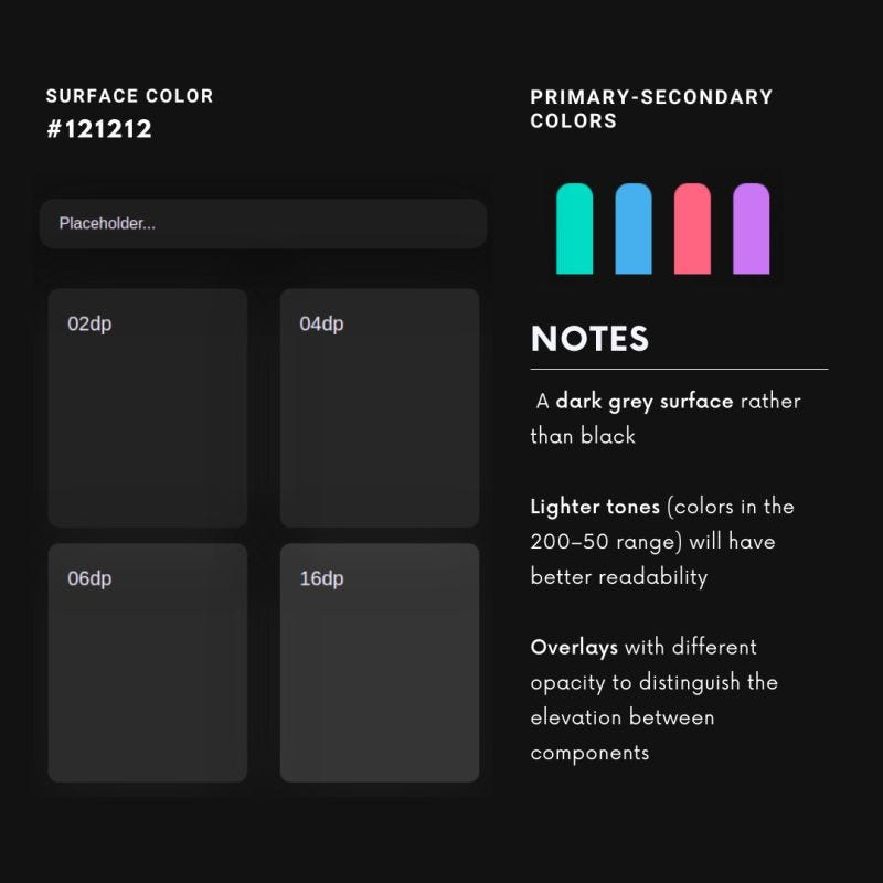
The implementation of high contrast readability mode requires thoughtful design considerations. It is not merely a matter of inverting colors, as naive inversions can introduce new readability problems or create visually jarring experiences. Effective high contrast design involves selecting color palettes that maintain differentiation while preserving aesthetic coherence. Designers must also account for the readability of images, icons, and other non-text elements, ensuring that the mode enhances overall clarity without obscuring meaningful content. Accessibility testing, including evaluations with real users who have visual impairments, is essential to refine these implementations and identify potential challenges.
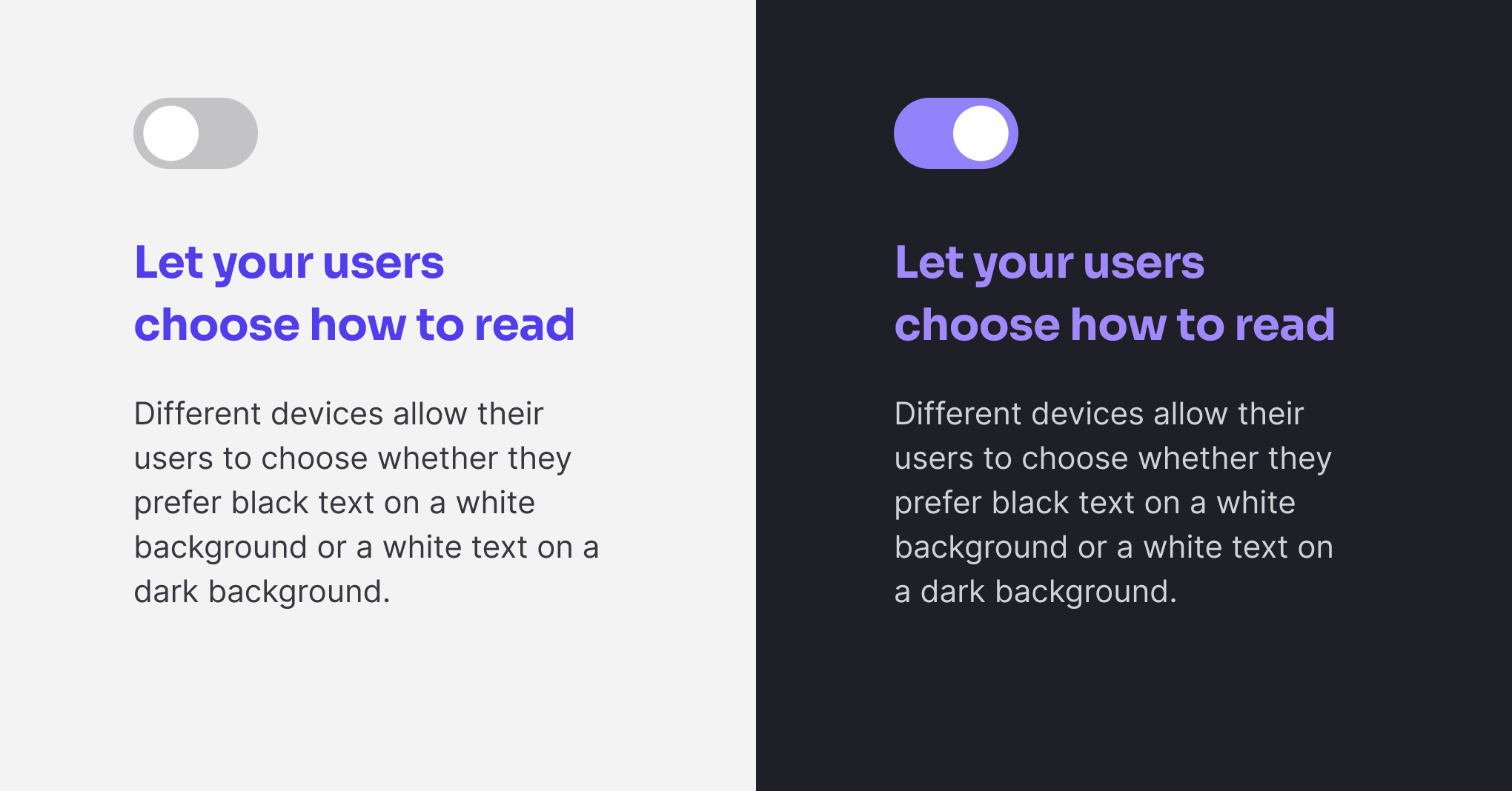
Beyond individual applications, operating systems increasingly offer system-wide high contrast settings that propagate across apps and interfaces. This ensures consistency in the user experience and allows individuals to maintain their preferred readability settings without repeatedly adjusting each application. System-wide modes often include additional enhancements, such as bold text options, larger cursor visibility, and accentuated focus indicators, all contributing to a comprehensive accessibility solution. By integrating these features at the OS level, users can benefit from a cohesive environment optimized for their visual needs.
High contrast readability mode also intersects with other accessibility features, creating synergistic effects that further enhance usability. For example, combining high contrast text with adjustable font sizes, text-to-speech functionality, and simplified layouts can dramatically improve comprehension for users with multiple accessibility requirements. This multi-faceted approach reflects the principle of universal design, where products are created to be usable by the broadest possible audience without the need for specialized adaptations. High contrast readability mode thus serves as a cornerstone of inclusive design, providing foundational improvements that complement other accessibility interventions.
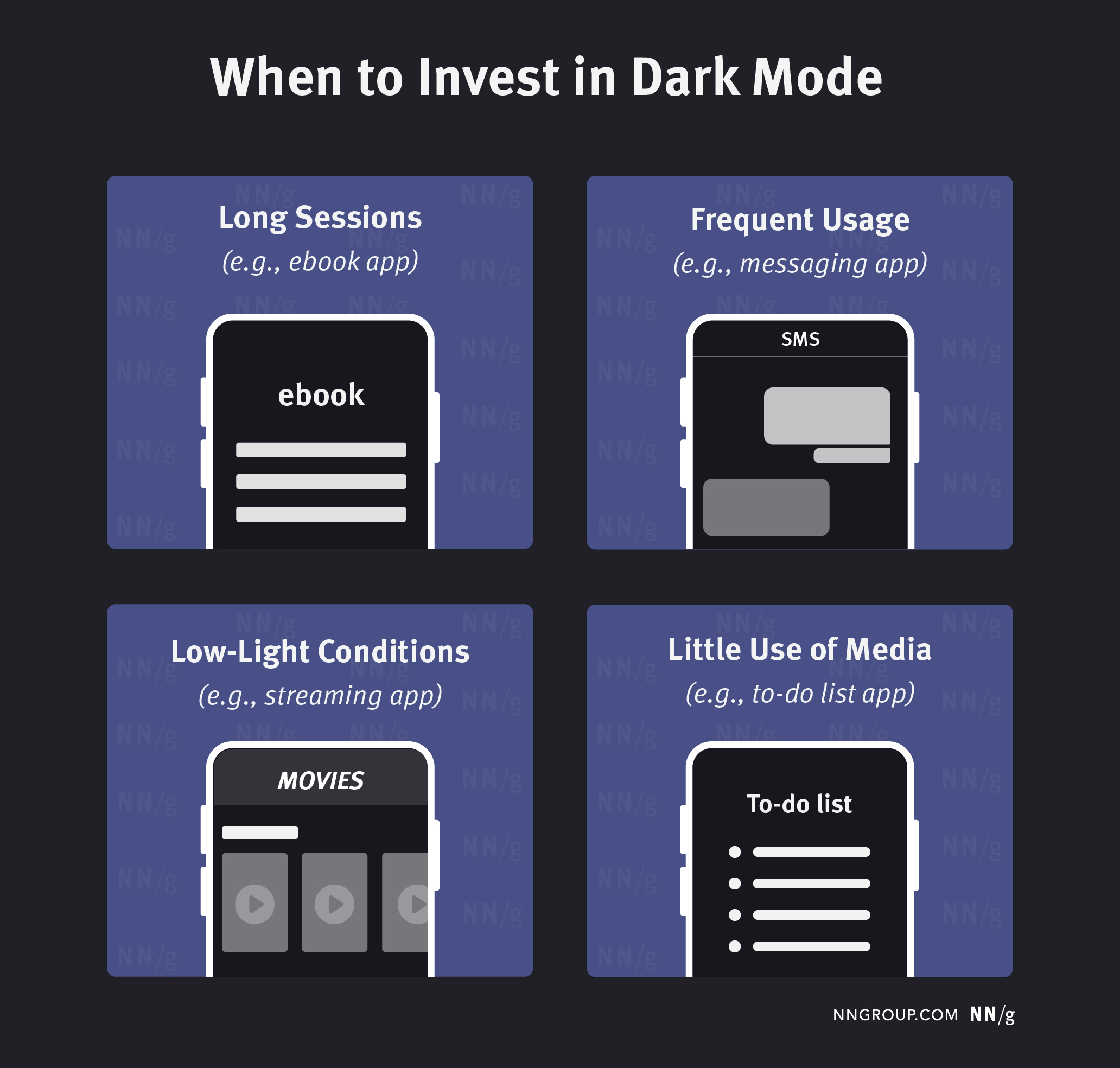
The benefits of high contrast readability extend to situational contexts as well. Users in bright outdoor environments or areas with glare-prone screens often struggle to perceive standard text and interface elements. High contrast mode mitigates these issues by emphasizing clarity and reducing dependence on ambient lighting conditions. Similarly, in low-light or nighttime settings, this mode can reduce eye strain and improve comfort, as it often allows for darker backgrounds and muted highlights while maintaining legibility. These situational advantages make high contrast readability an important consideration not only for accessibility but also for general usability across diverse contexts.
In summary, high contrast readability mode is a vital tool for improving digital accessibility, reducing visual fatigue, and enhancing overall user experience. By prioritizing clear differentiation between visual elements, it supports users with low vision, color blindness, and situational reading challenges. Effective implementation requires careful attention to color selection, interface coherence, and compatibility with complementary accessibility features. When executed thoughtfully, high contrast readability mode not only ensures compliance with accessibility standards but also fosters an inclusive, comfortable, and efficient digital environment for all users. It demonstrates how intentional design choices can bridge the gap between aesthetic considerations and functional accessibility, empowering a wider range of individuals to interact with digital content confidently and comfortably. Ultimately, this mode exemplifies the principle that accessibility enhancements benefit not only those with specific needs but also the broader user population, creating interfaces that are clearer, more intuitive, and universally approachable.